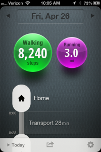
 For the last few months, I have a wee app on my phone that works in the background to track my activity. Called “Moves,” it presents a pretty and easy to use interface to annotate (somewhat) and review what I’ve done and where.
The simplicity is wonderful, so it’s been hard for me to work up the courage to suggest any changes. Any changes could potentially turn this simple app into a patchwork of different feature requests that kill the simplicity and calm of the app.
That said, I have been trying to wonder how to layer in deeper and deeper engagement with the app. I’d like to see users able to uncover a bit more, do a bit more as they become heavier and more frequent users of the app.
Browser interface to data?
For example, there’s no browser component to review the data on a larger screen. Currently, the only interface is on the phone. Getting the data off the phone opens things up for other uses of the data.
Business-wise, I can understand why the Moves folks don’t want anything beyond the app, as then there would be a whole web service they would have to create. But at the same time, this could open up the opportunity for an API so that hackers can take the tracked data and do new things with it.
Heck, why doesn’t Moves just make an API and let someone else deal with the browser interface?
Indeed, seems like they are considering releasing an API. Though not sure if it’s just on the phone or from their servers.
Life streaming?
Also, there is other data on the phone that could be folded in to Moves, such as images or text messages. Yes, I am harking back to my Lifeblog days. Moves already gives me a ribbon of activity. What if I could explore the images or text messages collected along the way?
And could this be layered for more active users? This ties back to my comment above that the interface reveal more of itself as I become a more proficient or more frequent user.
Just some thoughts. Have you had any thoughts on how to tweak Moves*?
*Please, no rants on battery drain.
