![]() One of my favorite radio stations in the Boston area, Phoenix WFNX 101.7, died an inglorious death last year. But, like the phoenix, it rose from its ashes as a live streaming radio station, supported by Boston.com (my home page for 10+ years). Now called RBdC (Radio Boston.com) it has multiple ways to access the radio stream. One of them is, of course, a mobile app.
One of my favorite radio stations in the Boston area, Phoenix WFNX 101.7, died an inglorious death last year. But, like the phoenix, it rose from its ashes as a live streaming radio station, supported by Boston.com (my home page for 10+ years). Now called RBdC (Radio Boston.com) it has multiple ways to access the radio stream. One of them is, of course, a mobile app.
While the idea of a digital-only local radio station is fantastic, I was a bit disappointed that the mobile app missed a few tricks. It failed to take advantage of the mobile modality (what I sometimes call the “mobile lifestyle”), and seems to act like some PC app.
Let me show you.
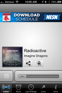
 Main screen – what’s missing?
The one major major omission that stands out like a big thumbs-up is a “Like” button. One of the benefits of a streaming station is the ability to collect data on the listeners – when, where, how long, who. But something that is even better, is that a music player is a feedback conduit. Sure, they could track how many tracks are purchased or shared, but I think they would get a ton of valuable data with a “Like” button. That would give feedback to the DJs on what is resonating with listeners – and of course, that data would be sliced and diced based on who is listening, when, where, and how long.
RBdC, use this app as a data collection tool to not only improve your station, but provide valuable data to your advertisers. And, no, you don’t really need to get creepy about it. There’s a ton of usage data (plus the “Like”) that you can collect that isn’t a violation of privacy.
Now imagine if all ads (and interstitials) also had their graphic and folks could “Like” them? Take that back to your advertisers.
[Gah, listening right now and so want to fave a tune. Great radio station as always, and I want to tell you so!]The only other comment I have on the main screen is that ton of white space. Why haven’t they used that whole space for the song graphic? What is that upper open space going to be used for?
This ain’t your grandfathers radio

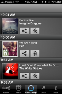
 I think it’s great that I can see what songs have played before. But why can’t I jump backwards and start the stream earlier? And where’s the pause button? As this is a stream, let me interact non-real-time, non-linearly with the station. Give me the ability to jump back or pause the stream. I know that this might be an issue with ads (ok, so don’t give me a FF button). But at least let me enter the stream at different points. One use would simply be that I see a song I love in the back stream or I want to replay it. Please?
And this is an app on a phone, so there will be many interruptions. I’d be pissed if I was into a tune and then got a call and missed most of the tune.
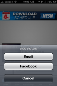
Also, as this is on a phone, why are the only options to share email or Facebook? What about text message (or Twitter for that matter)? I could text (tweet) a link to the song to a friend and the link opens up their RBdC app on their phone (and it starts at the beginning of the song) so they can hear the song as well and share the experience with me (if they didn’t have the app, it opens up the store to download it – spread that usage!).
Do my ears deceive me?
One last thing: I’ve used other streaming music apps, such as iHeartRadio and Pandora. The quality of the music on those apps is really rich and good on my phone. I feel that the audio quality RBdC app is just OK. I don’t think it’s using the full bandwidth it could use to stream music. Indeed, the science of streaming audio is ancient and I expect the quality of the audio to be the max the pipe can provide. Considering that my kids and I never use the radio in the car, blasting streaming tunes driving 80 65mph down the highway with full, rich audio, over 3G, I think RBdC could do the same.
Think mobile
I’m not writing this to poop on RBdC. They deserve a special place in the Boston music scene pantheon, both pre-break up and now as carrying the torch of alternative music in an age of pop-ification and homogenization of radio and TV music.
This exercise was simply to point simple ways a mobile app can take advantage of mobile and not just be a port of a desktop experience into a small screen. It frustrates me to no end when folks think a phone is a small computer. No, you need to understand the mobile lifestyle.
This isn’t 2005. It’s a very different world from what I wrote about at the start of this blog. The users, networks, and phones are way more sophisticated. So, I expect way more.
For those who know me, I haven’t spoken about mobile in a while (the therapist asked me to avoid it). But lately at work (around healthcare and life sciences) mobile has been smacking me in the face, so that part of my brain woke up and I’m back to mobile (to quote a famous mobile genius “Because I can’t shut-up”.). Expect more rantings in future.
[Argh! RadioBdC, another string of f-ing awesome tunes you’re playing in my head and I can’t tell you. You guys are great and I want you to know!]Do you have an app that misses a few key mobile-savvy features?
