 If you are an older runner, like me, there’s a high chance that smartwatches are nothing new to you.
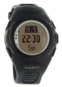
In 2005, when I was at Nokia Ventures Organization, there was a team looking into mobile connected devices in sports.[1] At one point they even hired the ex-CEO of Suunto (great guy, great stories[2]). For those who don’t know, Suunto is a manufacturer of “wrist-top computers”. Yes, these are now known as smartwatches (that’s a Suunto T6 in the image to the right).[3]
Back then was an interesting time for mobile sports tech: accelerometers were getting cheaper (Nokia was considering buying a company in that space), ANT was being promised as the ideal wireless networking for personal area networks and various sports watch manufacturers were adopting it, and GPS was becoming more widespread. Also, Nokia had a really cool app called SportsTracker that could use GPS to track your sports activities.[4]
Using a smartwatch in 2005
I bought a Suunto T6 (which comes with a heart-rate monitor strap and a barometer inside) and an accelerometer for €500 (the GPS pod wasn’t available yet). The HR monitor and accelerometer communicated with the watch via ANT wireless. Comparing it to the experience I had with SportsTracker (with GPS pod if phone didn’t have it), I got a great feel for what works and doesn’t in smartwatches and accessories (logging it all in some form in LifeBlog, of course).
What did I learn?
- The watch is a surface. Small and, by convention, glance-able, the watch has its limitation dictated by its form factor. No big surprise there. For example, having a small screen as a readout for my current HR, speed, and time is crucial for my run. I really never expect to do any deep interaction with the watch, either when in motion or when not, except what could be done with the buttons and small interface the watch has (start, stop, splits, perhaps even review log).
- Data has a freshness. Every data has its timeframe of usefulness and value. For example, once again, viewing the current HR, speed, and time helps me manage the run as it happens. But then, once downloaded to a computer[5], the HR and speed were relevant as a trend, not necessarily as an instant reading.
- Data has its time scale. For example, weather changes over hours, not minutes; a run is measured over tens of minutes and hours; HR and speed are averaged over seconds for current reading, but over the course of the run for overall activity performance. When and how data is useful and how you interact with it changes, it’s not a fixed thing.
- Data integration adds value. Having various sensors (speed, time, altitude, HR, GPS), plus adding other measured data such as temperature, weather, maps, allows calculations of other interesting things at the intersection of all this data. Though it’s not always true that more sensors and measurements are better.
- The connection to other “surfaces” is critical. Being able to easily view the data on another larger surface, say a PC or, these days, a smartphone, allows greater exploration of the data after the event. The watch is one surface in our overall pervasive computing environment. Use it as such, and take advantage of the form factors of other surfaces.
Where folks will trip up
I think each of these areas listed above will be spots where the “new” smartwatch manufacturers will trip up.
For example, my biggest concern is that smartwatch makers will forget that the watch is a surface on the wrist, thus best suited for certain interaction modes. When I hear things like making calls and texting, I think the manufacturers are missing a trick.
At Nokia, we used to talk about the “usability knee,” that quick fall-off of usability as a mobile device is pushed to do things it really isn’t made to do, due to form factor, interface design, and the like.[6] Really, these smartwatches can’t be more interactive than an iPod Nano. If you think you are going to shove a smartphone into a writwatch, then join the crowd of “cool but failed” tech.
And already I see connected device makers tripping up on the data integration and exploration side, providing interfaces too complex to easily interpret the data that comes off the device (I am looking at you FitBit).
Simple, mobile lifestyle
Simplicity will be key. Understand how the watch is a surface; that the data has a complexity in its value (in time and scale); and how best to interact with that data on various surfaces, from the watch to other larger screens, which also have different usability and interactivity environments.
Back in 2005, when talking about fusion of PC and mobile, I used to talk about the Mobile Lifestyle, that the mobile is not a PC, that it requires a different way of thinking that is consistent with the way folks expect to use a mobile device.[7] PCs are lean forward, flat surface, two eyes, two hands, large screen, keyboard. Mobiles are in-pocket, lean back, interruptive, snippets of time, one-handed, two thumbs, on the move. Does that make the watch, interrruptive, instant, glanceable, one-touch, one-finger, [calm? pervasive? suggest more?]?
Back then, I knew that trying to replicate the computer experience on mobile devices was wrong. Same goes for now: trying to replicate the smartphone experience on watches is also wrong.
Let’s see how these manufacturers do.
What do you think?
OMG, footnotes?
[1] Alas, after all the thinking and skills that they had, the best they came up with was a fancy pedometer.