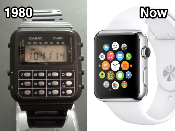
 Despite what many write, smartwatches have been around for a long time. I know this because I got my first smartwatch back in 2005 (or was it even earlier when I had a Casio C-80 calculator watch?).*
Nonetheless, The Verge’s article on defining smartwatches stands as a good reality-check for all the hype surrounding smartwatches. The article muses on aspects of connectivity, notifications, and apps, sort of orbiting a definition but realizing the difficulty in settling on one.
I had my own ideas as to what smartwatches were and were not. The Verge article, and a review by the inestimable DC Rainmaker, were the nudges I needed to get my own model smartwatch (Apple Series 2, Nike+ Edition, in case you’re wondering). As I mentioned before, the only real way of understanding smartwatches was direct user experience.
Not a review
I don’t want to review the watch here. Though I have not seen a review mentioning the clever First Use experience and smart symbiosis with the phone (mostly because all the reviews focus on the features and not the user experience).
And I might not be the novice user: I’ve had a smarter-than-the-average-bear watch for some time; I had a need for a new notification method[2]; and I had a targeted use case as a long-time Nike+ user.
Mobile Lifestyle now Watch Lifestyle
In the Verge article, notifications and apps were the top two smartwatch definitions users had voted for. And after using my new watch for a few months, notifications and a small selection of apps (original and uploaded) have been crucial to my use. Indeed, what makes the notifications and the apps work, is that the only ones I use on the watch are well-suited to the “watch lifestyle.”
Back in the day, when smartphones were beginning to take hold, and folks were starting to post photos and messages online from their phones, I had developed a model to describe the Mobile Lifestyle. The true qualities of mobiles (back then) were back pocket, one-handed, interruptive, glanceable, snippets, background activities. The desktop experience was two-handed, lean-forward, immersive, fire-hose, foreground activities.
But a funny thing has happened in the ensuing 10 years, the mobile has become a foreground object – it’s the main focus of two-handed, immersive, attention that a desktop computer was requiring back in the day (proof in this image).
The new glanceable surface
The smartwatch now has a role to play as a new glanceable surface, much like mobiles were long ago. The features that made smartwatches so useful long ago, such as surface glanceability, connectivity, sensor integration, still hold for today. Even more so now that we are usually nose-down on our phones.
And I’m not the only one realizing this. Various large companies are turning to watches as a way to surface important snippets of information or notifications. My favorite are restaurants and janitorial services using notification and interactions to manage the flow of on-demand services. Though, the “haptic afterimage” might be too much for some.
The problem with notifications is that you then get overwhelmed with notifications, shifting a problem on the phone to your wrist. The way I countered that was to further curate the categories of notification on my wrist. And I turned off all tones – I’ve gone pure haptic vibration for all my notifications.
Interestingly, the role of the watch to integrate notifications and data on a small glanceable surface is an opening for AI to make things better. Indeed, rumor has it that Siri will organize things better in the next watch OS.
And what about apps?
Much like the early days of apps on smartphones, watches will also benefit from focused point apps.[3] For example, using ApplePay with my watch was tremendously easier than using my phone. Indeed, the process was so fast and simple that, during my recent trip to Finland, merchants’ jaws dropped as I touched my watch to the sales terminals.
It’s not a crime to be a good watch with simple and direct features rather than some funky multi-app OS or some super-duper fitness gizmo with a watch as a second thought. Watches will succeed where they fit the watch lifestyle and interaction range.
What do you think?
[1] I am partial to the definition of connectivity, data, and surface glanceability as core features of a smartwatch. My Suunto T6, back in 2005, connected wirelessly to various sensors, provided a real-time readout to those sensors (notifications were related to the sensors), and connect to my computer via a data cable.
[2] I’m much more cognizant of the lockscreen on my phone. The watch, though, is set up to lock up when off my wrist, so it feels a lot more secure.
[3] I still think trying to shove full mobile phone features into a watch will hit the usability limits of the watch and just fail.
Image from Business Insider

1 Comment
Comments are closed.