I now have apps everywhere asking me to click a button to use GenAI to do the things I can do myself. So I sorta ignore them.
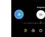
But last night I saw a Samsung ad on Prime* and the GenAI photo clean up button looked quite similar to the button Evernote keeps putting in front of me.
So I did a quick search to see where else I might have seen such similar buttons.
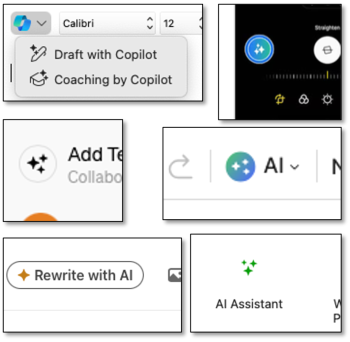
See the gallery below for a few I quickly found in less than a minute. Aside from Samsung, these are apps I use on a regular basis.
The dream of the future
What does it say about us that all these button designs converge on stars and magic fairy dust. Indeed, that they are all too alike makes me think I am late to the party and there were some shared winks or discussions that the GenAI icon would henceforth be fanciful stars, sorta like the similarities in other icons, like ‘save’ or ‘send’.
But _even_ if there was some agreement among designers, that we chose wishful dreamy stars to represent a GenAI action betrays our techno-optimistic view of what GenAI can do for us.
Clearly the design is meant to evoke magic, inviting folks to engage in a not-threatening way (‘It’s fairy dust!’). But will it be forever, like the disk icon has remained for ‘save’ even after the last of the floppy manufacturers fade away? [Imagining Colossus with a big fairy dust button
Help out here
What do you think? Also, let me know if you see other similar buttons or fairy-like depictions of GenAI.
Now I’m going to go sprinkle some pixie-dust on this blog post I’ve been working on.


*regarding Prime ad – thankfully, only at the start, and not interruptively stupid – I’m looking at you YouTube, especially during TinyDesk Concerts
Images, in case you’re still wondering, from Microsoft Copilot in Outlook MacOS, WordPress, LinkedIn, ChatGPT, Samsung, and Evernote

