This triggered an old funny memory (tho I might have the timing wrong).
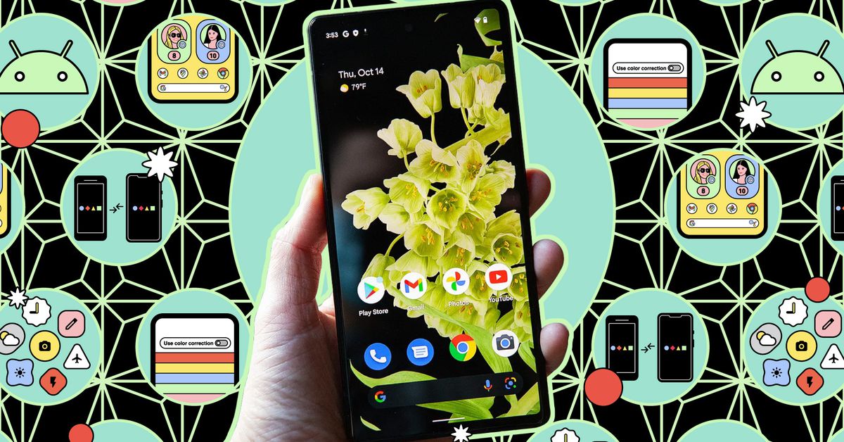
As phones got bigger, they got harder to handle with one hand. But there are some ways to make it just a little simpler. from: How to make it easier to use your phone one-handed – The Verge
Back in 2001, when we were getting ready to launch the Series 60 Platform, we were working up imagery for the launch. The designer of the interface, the inestimable Christian Lindholm (who mercifully halted a product naming fiasco by insisting it be called Series 60 with whatever we wanted in front or in back), was adamant that we emphasize the one-handed nature of the interface (yeah, it was his baby, and we were given 6 weeks to launch, so he had a healthy influence on our decisions).
Christian made useful suggestions of scenes we could show that would echo the benefits of one-handed operation. One of those images we found was a man, with a briefcase in hand and trench coat over his arm, in the process of getting out of an airport people cart (the ones that take folks across terminals).
Except, to me, and I said it, the guy looked he was about to have a heart attack. Haha.
I don’t think we ended up using that image. Haha.
The sound of one hand phoning
Indeed, my conversations with Christian led to me joining his Lifeblog team and then on to develop ideas around what I called the Mobile Lifestyle (which then led to Nokia Cloud (aka Ovi)).
At the time, folks were trying to shove the desktop life into phones. We could see that the desktop life was two-hands, lean forward, full attention type of computing. While I, influenced by Christian (who was still talking about it in 2007) and others, would describe the mobile life as one-handed (see?), interruptive (notifications), back pocket (when-needed interaction).
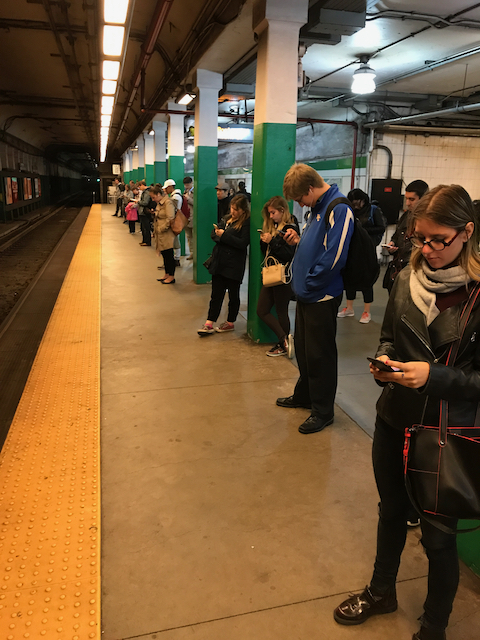
Well, these days phones are mostly two-hands, lean forward, and full attention.
How did that work out?
Image at top from Verge article

